
http://www.crawlerbasher.myby.co.uk/3D/Goobbue.jpg - The Sanctuary of Zi'Tah
http://www.crawlerbasher.myby.co.uk/3D/airwalf.jpg - LS Member in Valkurm Dunes
http://www.crawlerbasher.myby.co.uk/3D/BST-HD.jpg - Me at Bibiki Bay - Purgonorgo Isle
http://www.crawlerbasher.myby.co.uk/3D/Crawlerbasher1.jpg - Crawlerbasher
http://www.crawlerbasher.myby.co.uk/3D/Crawlerbasher-the-Beastmaster-of-the-world.jpg - Crawlerbasher, Beastmaster of the World.
http://www.crawlerbasher.myby.co.uk/3D/GM-Crawlerbasher.jpg - [GM]Crawlerbasher
http://www.crawlerbasher.myby.co.uk/3D/Crawlerbasher717C8drf61NM.png - Tarutaru GM
http://www.crawlerbasher.myby.co.uk/3D/top-of-the-world.jpg - I am on top of the world.
http://www.crawlerbasher.myby.co.uk/3D/Airwarf.jpg - LS Member
http://www.crawlerbasher.myby.co.uk/3D/Leech.jpg - Leech
http://www.crawlerbasher.myby.co.uk/3D/vana'dile.jpg - Vana'dile in space.
http://www.crawlerbasher.myby.co.uk/3D/Crawlerbasher-the-Beastmaster.jpg - Crawlerbasher the Beastmaster.
Alot of these are very large.
I will also be using this same topic on any other updates if I do any more.
All the lins relating to www.crawlerbasher.myby.co.uk are now dead and most of this can be found on my online web album which you can post comments on about the pictures.
http://picasaweb.google.com/crawlerbasher
Edited, Jan 5th 2010 6:00pm by Crawlerbasher
- Forums
- Final Fantasy XI
- General Discussion
- Crawlerbasher's 3D Art Works.
Crawlerbasher's 3D Art Works.Follow
Quote:
http://www.crawlerbasher.myby.co.uk/3D/Goobbue.jpg - The Sanctuary of Zi'Tah
Runnnn Goobbue before they get you!
With this and your other threads I can tell that you're trying really hard, and you are getting better the more you practice, but you still aren't quite 'there' yet.
You still need to work on the composition of your images. Take your "LS Member in Valkurm Dunes" image for instance. The models in this image are way too dark. Anything standing on a beach in bright sunlight will be lit from all sides, including from underneath, due to sunlight reflecting off the sand.
In "Crawlerbasher, Beastmaster of the World", you've left the entire right third of the image completely empty, and have crunched the image's subjects onto the left side. Not only that, but with the lack of a background, you really need to make the subjects more interesting. They are just there, with no part of the picture bringing attention to itself.
"Me at Bibiki Bay - Purgonorgo Isle" is a perfect example of both points above. The models aren't shaded to look like they are standing on a sandy beach in the middle of the day, and they aren't particularly interesting either. The positioning of the models could be better. Notice how the island in the background lies along the right third? Maybe you should try putting your model(s) near the left third? You should also have your models doing something. By standing there all rigid in the middle of the picture you've made them look like they are posing for a bad vacation photograph taken by someone's grandmother.
I could offer suggestions on each image, but instead I'll offer general guidelines to follow. Use reference images when trying to shade models properly. If you want to make an image of someone standing on a sandy beach in the middle of the day, then find a good image of someone standing on a sandy beach in the middle of the day and look closely at how the light illuminates different parts of their body.
Keep in mind the rule of thirds when making a composition. Most of your compositions look like you took a handful of subjects and tossed them onto a background. Placement of your points of interest is key to making a pleasing image.
In addition, keep in mind the saturation and brightness of each composition. If your background had lots of color and is bright, do the same to your models to make them fit in. You did an ok job of this with your picture of the leeches, however the leech in the middle of the photograph stands out in a bad way. Thumb though a National Geographic or two, and take a look at how those photographers compose an image. They usually doctor them up a bit, but even then, most National Geographic photographs are great compositions.
Keep trying, though. You obviously want to do better, I think you just need to work more on the basics of artistic composition.
These are pretty neat :P Reminds me of those wallpapers I've seen with FFXI characters on real life backgrounds.
lighting lighting lighting
Tzemescee had a lot of really good pointers. I like these pictures much more than your Dynamis renditions you posted last time. Definitely an improvement.
I agree that the Valkurm one has lighting issues, but to be fair he is standing behind that mound thing.
The forest background on the leech pic was very pretty.
The forest background on the leech pic was very pretty.
Hey man, like your pics. I enjoy the leech shot. :P Wouldn't want to get in the way of those things.
Some good advice for you from other posters. I don't have enough experience to pretend to be an authority, so I won't, I just know what I like to see.
Other than the points mentioned, the only thing that bugged me was the Goobue in the first picture. Is there a perspective conflict or something going on there? It doesn't seem to quite fit. It looks small, even though it's in relation to large trees.
Also sorta like you're looking at it from an equal or elevated perspective, though the background would imply otherwise. Could be way wrong, just it's angle seems a little weird.
Cool work, though, thank you for sharing. :D
Good pictures.
What software are you using altogether?
What software are you using altogether?
.
#10sfdxsm,
Posted: Oct 19 2009 at 6:59 PM, Rating: Sub-Default, (Expand Post) Nice. Also nice to see all the people with tons of "tips" who posted their amazing works that are that much better.
sfdxsm wrote:
Nice. Also nice to see all the people with tons of "tips" who posted their amazing works that are that much better.
So we have to be artists ourselves before we can critique a work of art? Can't imagine that'd do a lot of good for art museum ticket sales...
How'd you like that argument coming from a doctor that botched your surgery? "Gee thanks for pointing out that I left my watch in your ***; I'd like to see you do any better!"
Then again you may already have practice pulling things out of your ***.
sfdxsm wrote:
Nice. Also nice to see all the people with tons of "tips" who posted their amazing works that are that much better.
Sorry, I never did feel the need to validate myself by posting my artwork on a public forum. I'll gladly post up some of my ffxi images that I've made, if for no other reason than to make you eat your self-important words.
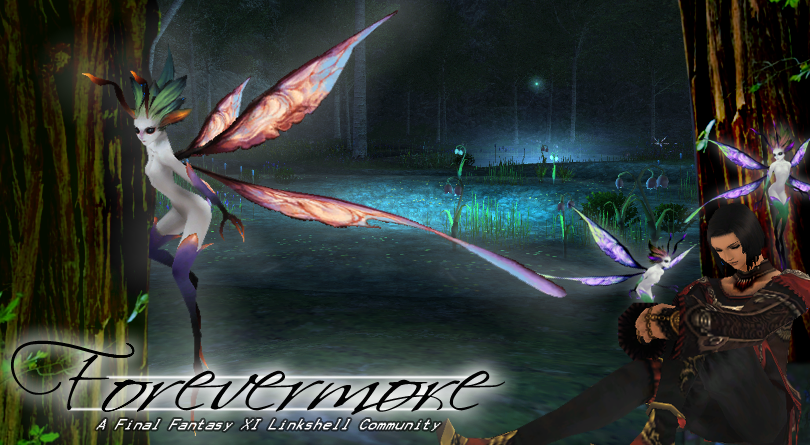
Forevermore linkshell's image banner
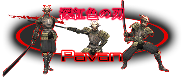
Forum sig for Pavan
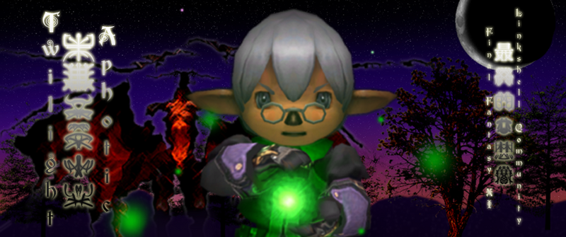
TwilightAphotic image banner (has nothing to do with the sh*tty novels)
FuzzyPickles image header EDIT: posted wrong link
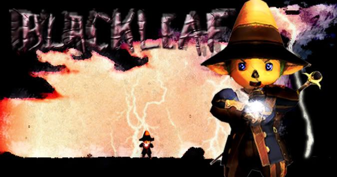
Blackleaf character portrait
Dierdra forum sig
My own forum sig
Uberman forum sig
Filian forum sig (small)
...and that's just a small sample of some of the ffxi-specific work I've done. If you're impressed by his 3d models, don't be. There's a plugin for 3D Studio Max that lets your import models directly from FFXI .dats, and I'll bet you dollars to donuts that plugin is what he's using to get his models.
My "tips" are regarding the composition of his images. Any person worth their artistic salt would instantly see that while Crawlerbasher's heart is in his work, he's got a lot to learn about the fundamentals before he can make something that pleasing to look at. I can tell CB's really trying hard to get better, and so I offered several tips to help him work towards being a better artist. I offered my tips in a critical, but constructive way, the same way my own art professors would do with me. Because he's trying hard to get better is the reason I did not flat out tell him that his work is bad and he should feel bad, which is exactly what most people on the internet would offer him.
Conversely, people like you, who have no inkling of what makes a good artistic render, tell him that his work is 'amazing' and 'awesome', when in truth it's mediocre. I gave him advice, and some encouragement to keep on trying. That's a lot more than what you gave him. However, since you took it on yourself throw the gauntlet and indirectly accuse me of not knowing what the hell I'm talking about, I'll not offer the same patience to you. Instead, I offer this artist's rendition of what I did last night.
To Crawlerbasher: Keep practicing. Work on the basics first, then move on to full 3D rendering.
Edited, Oct 19th 2009 10:34pm by Tzemesce
sfdxsm wrote:
Nice. Also nice to see all the people with tons of "tips" who posted their amazing works that are that much better.
Offering constructive criticism is ALWAYS a bad thing.
Maybe you shouldn't be shooting downtips, looks like you could use a few.
#14REDACTED,
Posted: Oct 20 2009 at 3:37 AM, Rating: Sub-Default, (Expand Post) Your images look pretty wack.
sfdxsm wrote:
Nice. Also nice to see all the people with tons of "tips" who posted their amazing works that are that much better.
Give me Four years to go get a degree in Computer Graphics and another two to build a portfolio so I can come back and say that the lighting is off in some of Crawlers pictures.
I like a lot of them though! The BST ones are obviously my favorite! Carrie looks awesome! Keep it up! You are improving!
This one I'm trying to work on the lighting and shadows.
http://www.crawlerbasher.myby.co.uk/3D/Singing.jpg
http://www.crawlerbasher.myby.co.uk/3D/Singing.jpg
Crawlerbasher wrote:
This one I'm trying to work on the lighting and shadows.
http://www.crawlerbasher.myby.co.uk/3D/Singing.jpg
http://www.crawlerbasher.myby.co.uk/3D/Singing.jpg
Take this model and put him indoors say in a bar on stage and it will look appropriate for the amount of light you've given him.
Beaches are bright!
Edited, Nov 5th 2009 3:08pm by Mielu
Mielu wrote:
Crawlerbasher wrote:
This one I'm trying to work on the lighting and shadows.
http://www.crawlerbasher.myby.co.uk/3D/Singing.jpg
http://www.crawlerbasher.myby.co.uk/3D/Singing.jpg
Take this model and put him indoors say in a bar on stage and it will look appropriate for the amount of light you've given him.
Beaches are bright!
Edited, Nov 5th 2009 3:08pm by Mielu
You other link was a lot more awesome

Quote:
http://www.crawlerbasher.myby.co.uk/3D/vana'dile.jpg - Vana'dile in space.
I'm using this as my desktop background. I love it.

Hey Crawler, what program do you use?
I have maya/softimage/3dstudio but haven't been able to export the models quite as good.
e.g: (with photoshop)
http://members.shaw.ca/icehunter/ffxi/Images/wife.jpg
http://members.shaw.ca/icehunter/ffxi/Images/Icehunter.jpg
I have maya/softimage/3dstudio but haven't been able to export the models quite as good.
e.g: (with photoshop)
http://members.shaw.ca/icehunter/ffxi/Images/wife.jpg
http://members.shaw.ca/icehunter/ffxi/Images/Icehunter.jpg
http://ffxi.allakhazam.com/story.html?story=18309
Quote:
Like Final Fantasy XI, the game specs will be extremely high for the time, but in about 5 years, an average machine can run it on max settings with little to no issues. Tanaka also expressed interest in making a benchmark program available.
FilthMcNasty wrote:
I endorse this thread.
Elionara wrote:
Hey Crawler, what program do you use?
Yes I was wondering this.
.
Some excellent artwork there, congrats!
PS: I love the BST pictures, they are my faves.
PS: I love the BST pictures, they are my faves.
Quite an improvement over your dynamis artworks. Keep up the good work!
And on that note, Tzemesce, your signatures look very cool, too. :)
Out of curiosity, though. On the Vana'Diel globe/globes you've used, the linings from the world/continent maps are show. Is this because of a lack of maps to work with or can it be removed to make it look more like an actual globe of Vana'diel?
I use 3D Max Studio 2010
FFXI Moudal viewer
Mqle - I just use this for mesh editing
Photoshop CS3 - but microsoft paint works just as well for creating alphah maps
And a plugin to imporat mql files into 3D studio max.
FFXI Moudal viewer
Mqle - I just use this for mesh editing
Photoshop CS3 - but microsoft paint works just as well for creating alphah maps
And a plugin to imporat mql files into 3D studio max.
Crawlerbasher wrote:
I use 3D Max Studio 2010
FFXI Moudal viewer
Mqle - I just use this for mesh editing
Photoshop CS3 - but microsoft paint works just as well for creating alphah maps
And a plugin to imporat mql files into 3D studio max.
FFXI Moudal viewer
Mqle - I just use this for mesh editing
Photoshop CS3 - but microsoft paint works just as well for creating alphah maps
And a plugin to imporat mql files into 3D studio max.
How strong is your PC? What are the specs?
.
Niklz wrote:
Quote:
http://www.crawlerbasher.myby.co.uk/3D/vana'dile.jpg - Vana'dile in space.
I'm using this as my desktop background. I love it.
Note to people wanting to do a globe of Vana'diel: if you put San d'Oria at Seattle's latitude, and Windurst at Jacksonville's, you've probably got the scale about right, even if zones are only about a mile or two across.
SUPER BANNED FOR FAILING TO POST 20K IN A TIMELY MANNER
Recent Visitors: 631
All times are in CST
Anonymous Guests (631)
- Forums
- Final Fantasy XI
- General Discussion
- Crawlerbasher's 3D Art Works.
© 2024 Fanbyte LLC